
Life Expectancy Explorer
GeorgeVajagich Maps & Navigation Contains ads
Compare US county vs foreign country life expectancies on an interactive map
- Downloads
- 17+
- on Google Play
- Price
- Free
- No in-app purchases
- Updated
- Aug 17
- 2026 · v1.0.0
Screenshots


About Life Expectancy Explorer
Welcome to Life Expectancy Explorer, a powerful interactive data visualization app that brings global health statistics to your fingertips. Have you ever wondered how your local area compares to the rest of the world? This app lets you explore and compare life expectancies across the globe and down to the granular US county level.
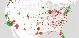
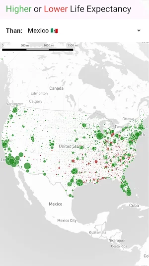
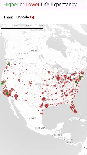
Select a baseline country and instantly watch the map transform. Our intuitive "Higher or Lower" color-coded system makes it incredibly easy to digest complex data: regions painted green have a higher average life expectancy than your selected country, while regions in red fall below that baseline.
Interactive Data Mapping: Smoothly pan and zoom across a high-performance map to explore global trends.
Granular Local Data: Includes highly detailed life expectancy statistics for every county in the United States.
Worldwide Comparisons: See exactly how different international regions stack up against one another.
Whether you are a data enthusiast, a public health worker, or simply curious about global health trends, this app offers a unique window into how long people live around the world. Dive into the numbers, compare your community to nations thousands of miles away, and discover the geographic patterns of human longevity.
Data Source: World Bank and University of Wisconsin Population Health Institute
Select a baseline country and instantly watch the map transform. Our intuitive "Higher or Lower" color-coded system makes it incredibly easy to digest complex data: regions painted green have a higher average life expectancy than your selected country, while regions in red fall below that baseline.
Interactive Data Mapping: Smoothly pan and zoom across a high-performance map to explore global trends.
Granular Local Data: Includes highly detailed life expectancy statistics for every county in the United States.
Worldwide Comparisons: See exactly how different international regions stack up against one another.
Whether you are a data enthusiast, a public health worker, or simply curious about global health trends, this app offers a unique window into how long people live around the world. Dive into the numbers, compare your community to nations thousands of miles away, and discover the geographic patterns of human longevity.
Data Source: World Bank and University of Wisconsin Population Health Institute
Alternatives to Life Expectancy Explorer
Looking for apps like Life Expectancy Explorer? Here are 6 similar Android apps on Google Play. The highest rated is Enclave Atlas USA (4.0/5), and all 6 are free to download.
-
Enclave Atlas USA 4.0
-
Socioeconomic Zones USA
-
Melting Pot Map
-
Export Data Globe
-
Cranes and Trains
-
Wealth Atlas Pro
| App | Rating | Price | Installs | Last updated | Compare |
|---|---|---|---|---|---|
| Life Expectancy Explorer | – | Free | 10+ | Aug 17, 2026 | |
| Enclave Atlas USA | 4.0 / 5 | Free | 500+ | – | Compare |
| Socioeconomic Zones USA | – | Free | 100+ | Aug 26, 2026 | Compare |
| Melting Pot Map | – | Free | 100+ | Aug 26, 2026 | Compare |
| Export Data Globe | – | Free | 100+ | Jul 7, 2026 | Compare |
| Cranes and Trains | – | Free | 10+ | Aug 27, 2026 | Compare |
| Wealth Atlas Pro | – | Free | 50+ | – | Compare |