
ORTEC Employee Self Service 7
1.5star
283 reviewsinfo
100K+
Downloads

PEGI 3
info
About this app
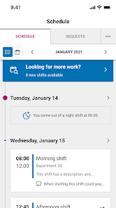
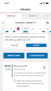
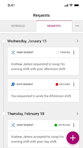
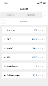
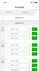
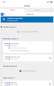
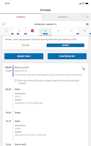
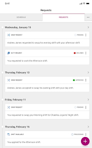
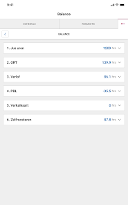
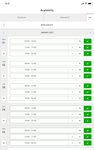
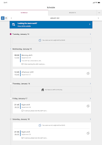
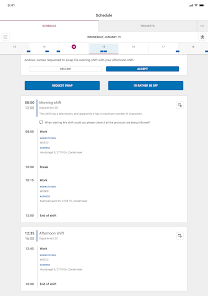
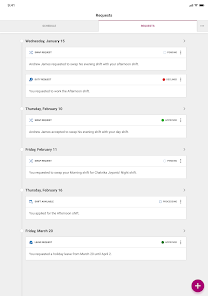
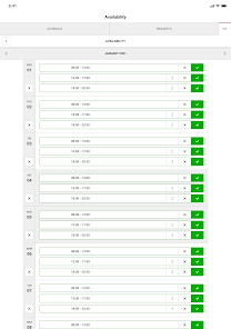
ORTEC Employee Self Service App: organize everything around your schedule using the ORTEC ESS 7 app. Exchange a shift, request leave or run an extra shift? Arrange it easily and quickly yourself in this app. Always at hand and easy to use. Within a few seconds you can arrange everything about your schedule yourself.
Updated on
Safety starts with understanding how developers collect and share your data. Data privacy and security practices may vary based on your use, region, and age. The developer provided this information and may update it over time.

No data shared with third parties
Learn more about how developers declare sharing

This app may collect these data types
Personal info and App activity

Data is encrypted in transit

You can request that data be deleted
Ratings and reviews
1.5
281 reviews

jorael
- Flag inappropriate
June 16, 2023
UI/UX on this new app is appalling. UX is particularly grating. I hate not having a clear weekly view of my schedule in one page like the old version did. There is too much going on in the UI. All i want is to clearly see my shifts in a simple and reliable format. Then after getting the app to work for a day, all i get after is a screen that says: "oops, something went wrong" and i have to uninstall and re-install the entire app.
4 people found this review helpful

Irem A
- Flag inappropriate
May 16, 2023
This new version of the app is truly abysmal and I hate it compared to the old one. The way my shifts appear on the schedule is very confusing compared to the old view, which was clear and easy to follow. The app is literally so bad it made me consider quitting my job and getting another where this app isn't in use. Please give us back the old way to view our shifts.
3 people found this review helpful

Pekka Sohlman
- Flag inappropriate
January 30, 2024
I can't see the whole week view like in the old one. Seriously change the visual layout or at least make other visual options available so that the user could see a whole week view. Now if you want to take a screenshot of your weekly shifts, you need to take several, while in the old one you could just take one screenshot and it would contain all of your shifts.
What's new
This new app version is prepared for users to effortlessly access reports when available.


