
myenergi
2.9star
736 reviews
100K+
Downloads

Everyone
info
About this app
The myenergi app is the centre of your myenergi ecosystem and a must for anyone who uses our eco smart products.
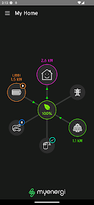
It provides a simple, visual dashboard to allow you to see just how your devices are working hard to reduce your energy cost and carbon footprint. The app seamlessly connects to all of your myenergi devices, giving you full control and access from anywhere in the world.
Main features:
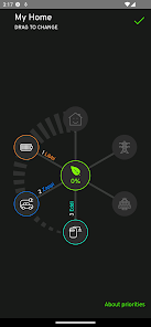
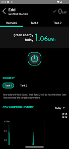
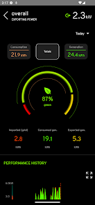
- View current household power distribution and consumption at a glance
- Intuitive animated display showing import/export, generation, power diversion and consumption
- Live and historic Self-Consumption and Green Contribution indicators
- Data is updated real-time
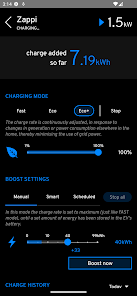
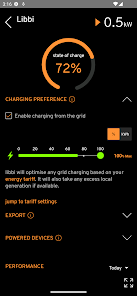
- Remotely control & monitor your devices
- Intelligent scheduling of devices with smart tariff integrations
- Priority setting of different devices
It provides a simple, visual dashboard to allow you to see just how your devices are working hard to reduce your energy cost and carbon footprint. The app seamlessly connects to all of your myenergi devices, giving you full control and access from anywhere in the world.
Main features:
- View current household power distribution and consumption at a glance
- Intuitive animated display showing import/export, generation, power diversion and consumption
- Live and historic Self-Consumption and Green Contribution indicators
- Data is updated real-time
- Remotely control & monitor your devices
- Intelligent scheduling of devices with smart tariff integrations
- Priority setting of different devices
Updated on
Safety starts with understanding how developers collect and share your data. Data privacy and security practices may vary based on your use, region, and age. The developer provided this information and may update it over time.

No data shared with third parties
Learn more about how developers declare sharing

This app may collect these data types
Personal info, App activity, and App info and performance

Data is encrypted in transit

You can request that data be deleted
Ratings and reviews
2.9
703 reviews

John McFarlane
- Flag inappropriate
September 24, 2023
Great app/device (Zappi 2 in my case) but UX is a disaster. Aesthetics: a combination of neon on black & brushed steel make for poor accessibility. Controls are awkward and laggy: text entry fields disappear off the side of the screen & activity is blocked on network traffic. But worse, modes of operation and their presentation. 'Boost' seems to replace 'charge' arbitrarily. Desc. for Eco and Eco+ are identical and opaque. Great hardware fights against frustrating software.
5 people found this review helpful

Guilherme Carvalho
- Flag inappropriate
February 23, 2024
I got a zappi charger and it works perfectly fine, however, the app isn't great. I find the app dated and it doesn't work at all. Too many charts. The app could be a lot easier to use. I set the schedule on the app to certain times and the car just started to charge automatically before the time set. App need a serious makeover and to be user friendly l.
4 people found this review helpful

Daniel Larkin
- Flag inappropriate
- Show review history
March 24, 2024
The actual Eddi and Zappi products are fine. This rating is purely for the app. I can forgive the responsiveness issues when changing settings, that's probably more to do with the integration between whoever built the backend and device settings retrieval. BUT, the UX of this app is probably one of the worst user experiences I've ever seen. It's like someone in the company insists on these dated design elements because they just don't know modern design patterns. Find a good UX engineer, PLEASE
2 people found this review helpful
What's new
- New vhub/hub connection flow
- Password reset process now available under Settings as well
- Warning message if multiple hubs enabled
- Fixed missing historical data due to timezone settings
- Fixed location sharing bugs
- Other minor bugfixes and improvements
- Password reset process now available under Settings as well
- Warning message if multiple hubs enabled
- Fixed missing historical data due to timezone settings
- Fixed location sharing bugs
- Other minor bugfixes and improvements
App support
phone
Phone number
+443333001303


