
Maybank Trade MY
2.8star
47 reviews
10K+
Downloads

Rated for 3+
info
About this app
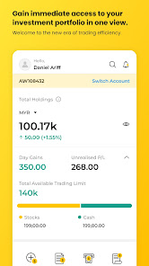
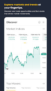
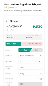
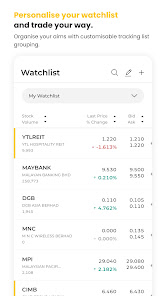
Maybank Trade app is the all-in-one trading app designed to equip traders, whether beginners or seasoned professionals, with everything you need for successful trading on the go. With a user-friendly interface and a host of powerful features, this app is your key to navigating the financial markets with confidence.
Key Features:
- Option to mask the amount in your Dashboard and Total Holdings
- Order status is now named according to Bursa Malaysia's guidelines
- Portfolio page redirection for an enhanced user experience Fixed partially matched order cancellation issue
- Fixed partially matched order cancellation issue
Download the new Maybank Trade app today and revolutionize your trading experience like never before. Take control of your investments and embark on a journey towards financial success with confidence and ease.
Updated on
Safety starts with understanding how developers collect and share your data. Data privacy and security practices may vary based on your use, region, and age. The developer provided this information and may update it over time.


Ratings and reviews
2.8
47 reviews

Cheong Shianq Huei
- Flag inappropriate
- Show review history
March 28, 2024
Not intuitive as it promoted. 1.) Back arrow is not sensitive, need multiple click sometimes in order to navigate back to previous view. 2.) Cost me 2 clicks + scroll down to view my portfolio details. 3.) In the portfolio detail page, "deposit" and "withdrawal" buttons are squeezing the viewing space causing less info to be displayed. We seldom use these 2 features, pls hide it somewhere. 4.) Bottom navigation bar would be disappeared in certain views which disallowed me to use those shortcuts.
10 people found this review helpful

Jeffrey Low
- Flag inappropriate
- Show review history
May 28, 2024
I have been using iTrade app for years. I was happy when I first heard about their new upgraded app. However, after installing and using the app, I don't find much improvement and app is still lagging behind MooMoo. Another thing that annoyed me is notifications. There are just too many. I turn it off using my phone system but app keep asking to turn on everytime I logged in. Very annoying.

Bernard Sia
- Flag inappropriate
- Show review history
May 16, 2024
Please improve the UX issues with the app. 1) spacing too wide, could have fit more stock data and more rows of stock 2) scrolling left to see more details of stock is not great experience. 3) Also allow default to watchlist preferred 4) navigation hotspot is too small. You practically have to fingernail to click the small X to close some window. The buttons hotspots are also too small. Please widen hotspot surface area to allow clicking 5) total holding not accurate
3 people found this review helpful
App support
phone
Phone number
+60320826890


